DIGITAL ARCHITECTURE · DESIGN SYSTEMS & HIGH-CONVERSION EXPERIENCES

UX/UI Design & Scalable Design Systems that Scale Without Breaking Your Code.

Are your users getting lost in confusing workflows, or is your engineering team burning weeks rebuilding inconsistent interfaces? At Berlo Desarrollos, we architect high-performance visual systems merging proven usability, atomic components, and production-ready design systems.

We design user-centered, scalable, and visually captivating digital experiences for Web Apps, SaaS platforms, and enterprise digital ecosystems. We reduce front-end development cycles by up to 40% through structured design tokens and high-fidelity interactive prototypes.

Strategy & Profitability

Why a Design System & Rigorous UX/UI Architecture Define Product Success

Design is not superficial decoration: it is the bridge between technical architecture and business objectives.

In enterprise software and SaaS development, the largest hidden financial drain is rework caused by improvised design decisions. When engineering teams build view-by-view without a shared design framework, each new feature introduces visual fragmentation, developer uncertainty, and cognitive friction that eventually drives churn.

At Berlo Desarrollos, we treat design with software engineering rigor: we build upon Atomic Design principles where every color value, spacing increment, button, and modal exists as a standardized Design Token. This establishes a singular shared language between product designers and software engineers, eliminating ambiguity and ensuring the live product matches design intent down to the pixel.

The outcome is an ultra-fluid, accessible digital platform with native Dark and Light mode support and an accelerated development velocity that brings features to market months ahead of your competitors.

Core Capabilities

End-to-End UX/UI Design & Interaction Architecture

A structured methodology built for mission-critical software and high-density applications.

01
COGNITIVE CLARITY

User Research & Information Architecture

Intuitive workflows where users complete goals effortlessly.

We analyze user archetypes, map complex customer journeys, and design logical navigation trees. We minimize click depth for critical transactions, drastically cutting bounce rates and user drop-off across core funnels.

Outcome: Frictionless user onboarding and a notable reduction in customer support requests due to disorientation.
02
VISUAL ENGINEERING

Design Tokens & Atomic Design Methodology

Modular components mapping directly to clean native code.

We architect systems from fundamental atoms (fluid typography via clamp(), accessible HSL palettes, spacing ramps, elevation), molecules, and organisms. Tokens are defined identically in Figma variables and CSS3 custom properties.

Outcome: Absolute fidelity between design and production with up to 40% reduction in front-end development time.
03
EARLY VALIDATION

Interactive Prototypes & Microinteractions

Experience and validate digital products before writing code.

We build dynamic, clickable prototypes with authentic interaction states (hover, focus, active, loading, error). Enables usability tests with stakeholders and end users to validate workflows prior to engineering sprint kickoff.

Outcome: Zero deliverable surprises and complete elimination of costly scope changes during development phases.
04
INCLUSION & COMPLIANCE

Universal WCAG 2.2 AA Accessibility by Design

Interfaces usable by everyone across every device and condition.

We audit typographic contrast, screen reader compatibility, semantic hierarchy, and complete keyboard-only navigation. We design with high-legibility palettes and minimum 44x44px touch targets across mobile surfaces.

Outcome: International regulatory compliance (ADA / EAA), broadened addressable audience, and superior SEO indexing.
The Differential Factor

How Our AI-First Methodology Elevates UX/UI Architecture

Rapid research velocity and heuristic validation guided by senior design leaders.

We never use artificial intelligence to produce generic, copy-paste interfaces. At Berlo Desarrollos, we leverage specialized language models and agentic automations as research and validation accelerators—multiplying analytical breadth while our human designers perfect aesthetic craftsmanship and strategic brand positioning.

Accelerated Benchmarking & Heuristic Audits

We analyze winning interaction patterns in your vertical and map ergonomic friction points across existing platforms in minutes.

Predictive Accessibility Auditing

We simulate screen-reader navigation pathways and continuously test chromatic contrast ratios to guarantee WCAG 2.2 AA certification.

Design Token Translation & Instant Handoff

We automate the conversion of Figma design variables into production-ready native CSS tokens, eliminating human transcription discrepancies.

Stress Testing Content & Edge Cases

We synthesize extreme content scenarios (long strings, multilingual labels, empty states, latency errors) to ensure UI components never break.

Real Projects

Production Design Systems & User Experiences

Case studies where visual consistency and UX engineering scaled tangible business metrics.

Afectiva Digital Health Patient Portal
Healthcare & Telemedicine

Afectiva Patient Portal

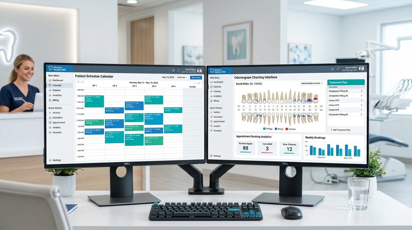
Comprehensive medical interface redesign. Simplified online appointment scheduling, crystal-clear lab history visualization, and senior-friendly touch targets.

✓ 55% drop in patient support tickets
COAM Professional Association Portal
Institutional & Complex Workflows

COAM Collegiate Platform

End-to-end design system for complex institutional paperwork and legal approvals. Standardized components for dense data tables, multi-step filing wizards, and status logs.

✓ Processing time cut by 50%
Sixteen High-Conversion Storefront
Retail & Conversion

Sixteen Storefront & Checkout

Mobile-first UX architecture with tactile microinteractions, single-step frictionless checkout, and rigorous heuristic tuning for peak checkout completion.

✓ +38% increase in mobile checkout conversions
Tangibles & Handoff

What Concrete Deliverables Does Your Enterprise Receive?

Clean, well-documented assets ready for implementation by your internal team or by our engineers.

Componentized Figma Library

Living components with interactive variants, Auto-Layout support, and complete state mapping (default, hover, focus, disabled, error).

Design Tokens in CSS/JSON

Semantic variables for color, spacing, radius, and fluid typography via clamp() exported directly as native CSS Custom Properties.

High-Fidelity Navigable Prototype

End-to-end interactive user flows designed for investor demos, stakeholder alignment, and real usability validation sessions.

Style Guide & UI Governance Manual

Clear accessibility documentation, UX copywriting best practices, content hierarchies, and guidelines for sustainable system scaling.

Answering Common Questions

Frequently Asked Questions About UX/UI & Design Systems

Everything you need to know before initiating the design or redesign of your digital product.

What is the difference between designing isolated screens and building a Design System?

Designing isolated screens generates visual inconsistencies, accumulates technical debt, and forces engineers to rewrite components repeatedly. A Design System is a living ecosystem of rules, reusable components (buttons, modals, forms, tables), and design tokens shared seamlessly between designers and developers. It allows new views to be launched in hours rather than weeks while ensuring absolute brand consistency across your entire platform.

Which tools do you use for deliverables and how do they integrate with development teams?

We deliver comprehensive Figma component libraries structured with Auto-Layout, component variants, and variable tokens, alongside exportable code specifications (CSS custom properties, token JSONs, interactive state documentation). Additionally, we provide direct native front-end implementation (HTML5/CSS3/Vanilla JS) closing any communication gap between design and engineering.

Does the design include universal accessibility (WCAG 2.2 AA) and Dark/Light mode support?

Absolutely. From day one we audit color contrast ratios (minimum 4.5:1 for standard text), minimum touch target dimensions (44x44px), visible keyboard focus states, and semantic hierarchies for screen readers. Color tokens are semantically structured to support instant dark and light mode switching without duplicating code.

How does the AI-First methodology enhance UX/UI interface design?

We deploy agentic AI pipelines to accelerate usability research, generate comprehensive edge-case data matrices, and validate color contrasts and user journeys before user testing. Human senior designers curate aesthetic elegance, brand personality, and microinteraction refinements.

How long does it take to develop a Design System or prototype a complete application?

A heuristic audit and optimization of key journeys takes 1 to 2 weeks. A complete UI design and interactive prototype for an MVP or Web App is typically delivered in 3 to 5 weeks. A comprehensive enterprise-grade Design System complete with token architecture and governance documentation takes 6 to 8 weeks with continuous validation.

LET'S ARCHITECT YOUR DIGITAL SYSTEM

Ready to transform your user experience and scale your product?

Schedule a design diagnostic session or contact us directly via WhatsApp. Let's create an unforgettable interface and a scalable design system that accelerates your business.